

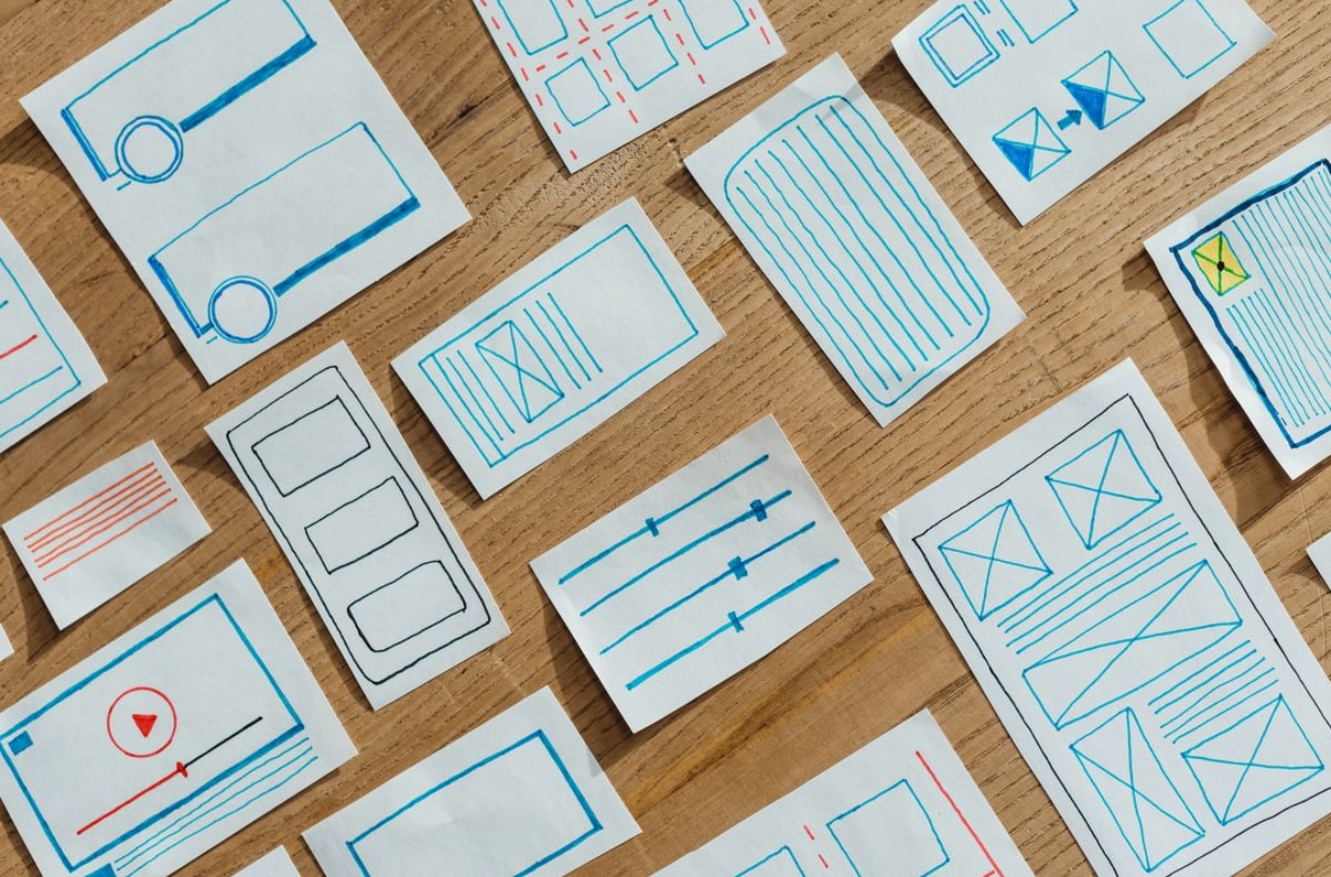
When you land on a website and instantly know where to look first, that is not luck. That is visual hierarchy in web design doing its job. It is the invisible system designers use to control the order in which your eyes scan a page, and it is one of the most important skills any web designer or website owner can master.
In this guide, we break down 8 core principles of visual hierarchy with real examples you can apply to your own site today. No jargon, no theory dumps, just clear explanations of what works and why.
What Is Visual Hierarchy in Web Design?
Visual hierarchy is the intentional arrangement of design elements (text, images, buttons, colors, whitespace) in an order of importance. It tells visitors what to look at first, second, and third, guiding them naturally toward the actions you want them to take.
Think of it like a conversation. Without hierarchy, every element is shouting at the same volume. With hierarchy, your design whispers, talks, and shouts at the right moments.
Why it matters:
- Users decide whether to stay on a page in under 3 seconds
- Strong hierarchy improves conversion rates and lowers bounce rates
- It makes content scannable, which is how 79% of users actually read online
- It builds trust by making your site feel professional and organized
The 8 Principles of Visual Hierarchy in Web Design
1. Size and Scale
Bigger elements grab attention first. It is the simplest rule in design and the most powerful. Headlines should be larger than subheadings, which should be larger than body text. Hero images should dominate above the fold.
Real example: Visit Apple.com and look at any product page. The product name is massive, the tagline is medium, and the technical description is small. Your eye travels in that exact order.
Quick tip: Use a clear type scale. A common ratio is 1.25x or 1.5x between heading levels.
2. Color and Contrast
Bright, saturated colors against neutral backgrounds pull the eye like a magnet. This is why call-to-action buttons are almost always a contrasting color from the rest of the page.
Real example: Spotify uses a mostly black interface with bright green CTAs. You cannot miss the “Sign up free” button because everything else fades into the background.
Quick tip: Pick one accent color for primary actions and use it sparingly. If everything is highlighted, nothing is.
3. Typography and Font Weight
Bold weights, italic styles, and font pairings create rhythm. A heavy headline next to light body text immediately signals importance.
Real example: Stripe uses heavy display fonts for their main value propositions and clean, light sans-serif for explanatory text. The contrast guides you through their story.
| Element | Recommended Weight | Recommended Size |
|---|---|---|
| H1 Hero | 700-900 | 48-72px |
| H2 Section | 600-700 | 32-40px |
| H3 Subsection | 500-600 | 24-28px |
| Body | 400 | 16-18px |
4. Spacing and Whitespace
Whitespace (also called negative space) is not empty space. It is breathing room that helps elements stand out. Cramped designs feel chaotic. Spacious designs feel premium.
Real example: Notion and Linear both use generous whitespace around their headlines and CTAs. The result feels calm and confident.
Quick tip: Group related items closer together and separate unrelated items with more space. This is called the proximity principle.
5. Alignment and Grids
Aligned elements feel organized. Misaligned elements feel sloppy and amateur. Using a consistent grid (12-column is standard for web) creates invisible order users can feel even if they cannot see it.
Real example: Airbnb uses a strict grid system for property cards. Every image, title, and price aligns perfectly, making the page easy to scan even with hundreds of listings.
6. Position and the F-Pattern
Western users read in an F-shape or Z-shape pattern. The top-left corner gets the most attention, followed by the top-right, then a horizontal scan across the middle.
Real example: Most SaaS landing pages place their logo top-left, navigation top-right, headline top-center, and primary CTA right below. This is no accident.
Quick tip: Place your most important message and action in the top third of the page.
7. Repetition and Consistency
Repeating styles, colors, and shapes throughout a site creates a sense of unity. When users learn that all green buttons are clickable actions, they navigate faster and trust more.
Real example: Shopify uses the same button style, the same green accent, and the same card layout across their entire marketing site. You always know what to expect.
8. Visual Direction and Cues
Arrows, lines, gaze direction in photos, and even subtle gradients can point users toward what matters. If a person in your hero image is looking at a button, users will look there too.
Real example: Many landing pages use subtle illustrations with characters pointing or facing toward signup forms. It works because we instinctively follow the gaze of others.

How to Audit Your Own Website for Visual Hierarchy
Run this quick test on any page of your site:
- Squint at the page until it blurs. What still stands out? That is your hierarchy.
- Ask someone unfamiliar with your site to look for 5 seconds, then close their eyes and tell you what they remember.
- Take a grayscale screenshot. If your CTA disappears without color, it relies too heavily on color alone.
- Count how many “loudest” elements compete on screen. If more than two, simplify.
Common Visual Hierarchy Mistakes to Avoid
- Too many CTAs: When everything is a priority, nothing is
- Low contrast text: Light gray on white may look modern but fails accessibility
- Identical heading sizes: Users cannot tell sections apart
- No whitespace: Cramming content makes pages feel overwhelming
- Inconsistent button styles: Confuses users about what is clickable
- Ignoring mobile: Hierarchy that works on desktop often breaks on smaller screens

Visual Hierarchy Checklist for Your Next Project
| Check | Why It Matters |
|---|---|
| Is there one clear focal point per section? | Prevents user confusion |
| Does your primary CTA stand out by color and size? | Drives conversions |
| Are headings clearly different from body text? | Improves scannability |
| Is whitespace used generously? | Reduces cognitive load |
| Is the design consistent across pages? | Builds trust |
| Does it work on mobile? | Over 60% of traffic is mobile |

Final Thoughts
Visual hierarchy in web design is not about making things pretty. It is about communication. Every size, color, and spacing decision tells your user what to care about and in what order. Master these 8 principles and you will create websites that feel intuitive, professional, and effective, even before users consciously notice why.
Looking for inspiration? Browse our curated gallery of award-winning websites on CSS Gallery Pro to see these principles in action across dozens of industries.
Frequently Asked Questions
What is visual hierarchy in web design in simple terms?
Visual hierarchy is the order in which a designer wants you to notice things on a webpage. It uses size, color, contrast, and spacing to guide your eyes from the most important element to the least important.
What are the main principles of visual hierarchy?
The core principles are size, color and contrast, typography, spacing, alignment, position, repetition, and visual cues. Together they help designers control where users look first and how they move through a page.
What is an example of good visual hierarchy?
Apple’s product pages are a classic example. The product name is huge, the tagline is medium, and supporting details are small. A single colored CTA button stands out against a clean white background, making the next step obvious.
How do I improve visual hierarchy on my website?
Start by identifying the single most important action on each page. Make it the largest, boldest, and most colorful element. Then organize everything else around it using consistent spacing, alignment, and typography.
Is visual hierarchy the same as UI design?
No. UI design is the broader practice of designing user interfaces. Visual hierarchy is one principle within UI design that focuses specifically on ordering and prioritizing elements visually.